This post may contain affiliate links. If you make a purchase through these links, we may earn a commission at no additional cost to you.
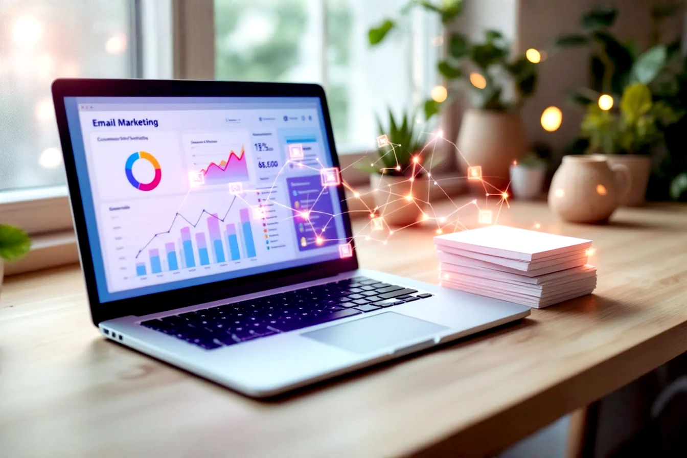
Email remains a powerhouse in digital communication and marketing. Despite the rise of social media and other platforms, a well-crafted email can deliver unparalleled return on investment. But what makes an email “well-crafted”? More often than not, it boils down to its design. In 2025, flawless email design is non-negotiable. It’s the first thing your subscribers notice, and it profoundly influences their decision to read, engage, or hit delete.
The impact of thoughtful email design extends far beyond aesthetics. It directly affects open rates, engagement, click-through rates, and ultimately, conversions. A poorly designed email can frustrate users, damage your brand perception, and render your message ineffective, no matter how valuable its content. Conversely, a strategically designed email enhances readability, builds trust, guides the user towards your desired action, and ensures your message is accessible to everyone.
This definitive guide will walk you through everything you need to know, from foundational principles and layout strategies to mobile optimization, typography, visual elements, accessibility, and emerging trends, empowering you to craft emails that not only look great but also deliver maximum readability and impact.
Foundations of High-Impact Email Design: Strategy and Goals
Before diving into the pixels and code, successful email design starts with a solid strategy. Understanding who you’re talking to and what you want to achieve are the bedrock upon which all effective design decisions are built.
Know Your Audience: The Cornerstone of Effective Email Design
The single most important factor in designing effective emails is understanding your audience. Who are your subscribers? What are their demographics, preferences, technical savviness, and online behaviors? Are they reading emails on the go on their mobiles, or are they more likely to engage on a desktop during work hours?
Audience insights should shape every design choice you make. For instance:
- An older demographic might appreciate larger font sizes, simpler layouts, and very clear calls to action.
- A tech-savvy audience might be more receptive to interactive elements, animations, or more complex visual designs.
- Subscribers in a specific industry might respond better to a more formal tone and design, while a lifestyle brand might opt for something more playful and visually rich.
Tools and techniques for gathering audience data include analyzing your existing email marketing metrics (which segments have higher engagement?), conducting surveys, reviewing customer support feedback, and developing user personas. The more you know about your audience, the better you can tailor your email design to meet their needs and expectations, leading to significantly higher engagement.
Defining a Clear Objective: Every Email Needs a Purpose
Every email you send should have one primary objective. Trying to achieve too many things with a single email will confuse your audience and dilute your message. This is often referred to as the “One Goal, One Email” principle.
Your primary goal will heavily influence the email’s layout, the prominence of your Call to Action (CTA), and the content itself. Ask yourself: What is the single most important action I want the recipient to take after reading this email?
- Is it to drive sales for a new product? Your design will feature the product prominently with a clear “Shop Now” CTA.
- Is it to increase webinar sign-ups? The design will highlight the webinar’s value proposition and have an unmissable “Register Here” button.
- Is it to share important news or updates? The design will prioritize clear, scannable information.
Without a clear objective, your design will lack focus and fail to guide the user effectively. Once you’ve defined your goal, every design element should work in concert to achieve it.
Maintaining Brand Consistency: Reinforcing Your Identity
Your emails are an extension of your brand. Maintaining brand consistency across all your communications, including email, is crucial for reinforcing your identity and building trust. When subscribers open your email, they should instantly recognize that it’s from you.
This involves:
- Using your brand colors, fonts, and logo consistently. Your email color palette should align with your website and other marketing materials. If you use specific fonts for your brand, ensure they (or appropriate fallbacks) are used in your emails.
- Ensuring the overall tone and style of the email design align with your brand’s personality. Whether your brand is playful, sophisticated, minimalist, or bold, your email design should reflect that.
- Aligning email design with your website and other marketing channels. This creates a cohesive brand experience for your audience.
The psychological impact of consistent branding is significant. It makes your brand feel more professional, reliable, and familiar, which in turn fosters trust and recognition. When users trust your brand, they are more likely to engage with your emails and convert.
Structuring for Success: Layout and Visual Hierarchy in Email Design
Once your strategy is in place, the next step is to structure your email for optimal readability and user experience. A well-thought-out layout and clear visual hierarchy are key to guiding your subscribers through your message and towards your call to action.
Mastering Email Layout: From Single Column to Modular Design
The layout of your email dictates how content is organized and presented. The right layout can make your email easy to scan and digest, while a poor layout can lead to confusion and abandonment.
The Power of Simplicity: Why Single-Column Layouts Dominate
For most email marketing purposes, the single-column layout is king. This layout stacks content vertically in one column, making it incredibly easy to read and scroll through, especially on mobile devices.
- Benefits for mobile readability: With over half of all emails being opened on mobile, a single-column design adapts seamlessly to smaller screens without requiring horizontal scrolling.
- Guides the eye naturally: It creates a clear, linear path for the reader’s eye to follow from top to bottom, leading them logically through your content to the CTA.
- Simplicity in design and coding: Single-column layouts are generally easier and faster to design and code, and they tend to render more consistently across different email clients.
Multi-Column Layouts: When and How to Use Them Effectively
While single-column is often preferred, multi-column layouts can be effective in specific situations, such as e-commerce emails showcasing multiple products side-by-side or newsletters that need to present diverse content snippets.
- Use cases: Product roundups, content digests, or when you need to display related pieces of information in parallel.
- Challenges: Multi-column layouts can become cluttered if not designed carefully and pose significant challenges for mobile responsiveness. Often, on mobile, columns will need to “stack” vertically to remain readable, which requires careful coding. If you opt for a multi-column layout, ensure it simplifies to a single column on smaller screens.
The Inverted Pyramid: Guiding Readers to Your CTA
The inverted pyramid model is a classic content structuring technique that works exceptionally well for email design. It involves:
- Wide top: Start with a compelling headline and an engaging hero image or key message to grab attention immediately.
- Narrowing middle: Provide supporting details, benefits, and persuasive copy that builds interest and desire.
- Pointed bottom: Conclude with a clear and prominent Call to Action (CTA) that tells the reader exactly what to do next.
This structure naturally guides the reader’s focus from general interest to specific action.
Modular Design: Flexibility and Scalability in Email Structure
Modular design involves creating emails from a series of reusable content blocks or “modules.” Each module (e.g., a header, an image block, a text block, a CTA button) is designed and coded independently and can then be combined in various ways to build different emails.
- Benefits:
- Efficiency: Speeds up the email creation process.
- Consistency: Ensures brand consistency across campaigns.
- Flexibility: Allows for easy customization and A/B testing of different content arrangements.
- Scalability: Makes it easier to manage and update a large library of email templates. Many modern email service providers (ESPs) offer drag-and-drop editors based on modular design principles.
Establishing Clear Visual Hierarchy: Directing Attention Strategically
Visual hierarchy is the arrangement and presentation of design elements in order of their importance. A strong visual hierarchy tells the reader what to look at first, second, third, and so on, making the email easier to scan and understand.
- Techniques to establish visual hierarchy:
- Size: Larger elements appear more important. Your main headline should be larger than subheadings, and body text should be smaller still.
- Color: Bright, contrasting colors can draw attention to key elements like CTAs.
- Contrast: High contrast between an element and its background makes it stand out.
- Spacing (White Space): More space around an element can give it prominence.
- Placement: Elements placed higher on the page or in conventional spots (like a CTA at the end of a section) are often perceived as more important.
- Typography: Using different font weights (bold, regular) and styles can differentiate levels of information.
Your most important message and your primary CTA should be the most visually prominent elements in your email.
The Magic of White Space (Negative Space): Enhancing Readability and Focus
White space (or negative space) refers to the empty areas around and between design elements (text, images, buttons). It’s not “wasted” space; rather, it’s a crucial design tool.
- Role in email design:
- Reduces cognitive load: A cluttered design overwhelms the brain. White space gives content room to breathe, making it easier to process.
- Improves comprehension and readability: It helps separate distinct sections of content and makes lines of text easier to follow.
- Creates focus: By isolating elements, white space can draw attention to what’s important, like your CTA.
- Conveys elegance and sophistication: Generous use of white space often contributes to a cleaner, more professional aesthetic.
Practical tips for using white space effectively:
- Increase margins and padding around text blocks and images.
- Ensure adequate line spacing (leading) in your paragraphs.
- Leave space around your CTA button to make it stand out.
- Don’t try to cram too much information into a small area.
Designing for Scannability: Catering to Short Attention Spans
People rarely read emails word-for-word, especially the first time they open them. Instead, they scan for relevant information. Designing for scannability is essential to capture their attention quickly and convey your key message.
- Use clear, concise headings and subheadings to break up text and highlight main topics.
- Employ bullet points and numbered lists for lists of features, benefits, or steps. They are much easier to scan than dense paragraphs.
- Keep paragraphs short (2-3 sentences ideally).
- Use bold text sparingly to emphasize key phrases or keywords. Overuse can diminish its effect.
- Front-load important information: Put the most critical details at the beginning of sentences and paragraphs.
By making your email easy to scan, you increase the chances that your subscribers will grasp your core message and engage further.
Mobile-First and Responsive Email Design: Reaching Users Everywhere
With a significant majority of emails now opened on mobile devices, a mobile-first approach to email design isn’t just a good idea—it’s an absolute necessity. Responsive design ensures your emails look and function perfectly, no matter the screen size.
The Mobile Imperative: Why Mobile-First is Crucial
Consider these statistics:
- Over 50% of all emails are opened on mobile devices, and this number continues to grow. Some reports indicate figures as high as 70-80% for certain demographics or industries.
- A poor mobile experience can be incredibly frustrating for users. If an email is difficult to read or interact with on a smartphone, most users will simply delete it, and many might even unsubscribe.
- Mobile-first design prioritizes the user experience on the smallest screens from the outset, ensuring core content is accessible and CTAs are tappable.
Designing for mobile first often leads to simpler, more focused emails, which also benefits desktop users by improving clarity and reducing clutter.
Responsive Design Techniques: Ensuring Adaptability
Responsive email design uses a combination of flexible layouts, scalable images, and CSS media queries to adapt the email’s presentation to different screen sizes and resolutions.
Fluid Layouts: Using Percentages for Widths
Instead of using fixed pixel widths for your email tables and containers (e.g., width="600px"), fluid layouts use percentages (e.g., width="100%").
- Technical explanation: A container with
width="100%"will expand or contract to fill the available width of the screen or parent container. This allows the layout to adjust smoothly to different device widths. - Often, a
max-widthis set (e.g.,max-width: 600px;) to prevent the email from becoming too wide on large desktop screens, while still allowing it to shrink on mobile.
Scalable Images: Ensuring Images Resize Gracefully
Images also need to be responsive. If an image has a fixed width larger than the mobile screen, it can break the layout or require horizontal scrolling.
- Technical explanation: The CSS
max-width: 100%;andheight: auto;properties are commonly used for images.max-width: 100%;ensures the image never exceeds the width of its container.height: auto;maintains the image’s aspect ratio as it scales, preventing distortion.
img { max-width: 100%; height: auto; display: block; /* Prevents extra space below images in some clients */ }
Media Queries: Tailoring Styles for Different Screen Sizes
Media queries are CSS rules that apply styles only when certain conditions about the device (like screen width) are met. They are the cornerstone of responsive email design.
- Simplified explanation: Think of them as “if-then” statements for your email’s appearance. For example, “IF the screen width is 600 pixels or less, THEN make the font size larger and stack the columns.”
- Example:
<style type="text/css"> /* Default styles for larger screens */ .body-text { font-size: 16px; } .two-columns .column { width: 50%; float: left; } /* Media query for smaller screens */ @media screen and (max-width: 600px) { .body-text { font-size: 18px !important; } /* Increase font size */ .two-columns .column { width: 100% !important; float: none !important; } /* Stack columns */ .mobile-hide { display: none !important; } /* Hide certain elements */ .mobile-show { display: block !important; } /* Show certain elements */ } </style>Note: Many email clients, especially Gmail, have limited support for styles in the<head>. Therefore, critical responsive styles are often inlined, and media queries are used for enhancements. Some email clients also require!importantto override inline styles.
Touch-Friendly CTAs: Designing Buttons for Thumbs
On mobile devices, users interact with their thumbs and fingers. CTAs need to be large enough and have enough surrounding space to be easily and accurately tapped.
- Minimum button size: Apple’s Human Interface Guidelines recommend a minimum target size of 44×44 pixels for touch controls. Google recommends 48x48dp. Aim for this or larger for your email CTAs.
- Adequate spacing: Ensure there’s enough white space around your CTA buttons. This prevents users from accidentally tapping the wrong link or element, which is a common source of frustration.
Testing Responsive Emails: Tools and Best Practices
Given the wide variety of email clients and devices, thorough testing is crucial for responsive email design.
- Use email testing platforms: Services like Litmus and Email on Acid allow you to preview how your email will render across dozens of different email clients, web browsers, and devices (both desktop and mobile). They can save you countless hours of manual testing.
- Send test emails to actual devices: While preview tools are invaluable, it’s also wise to send test versions of your email to a range of actual smartphones and tablets you have access to (iOS, Android). This allows you to check for interactivity, loading speed, and overall user experience in a real-world context.
- Check in both portrait and landscape orientations on mobile devices.
Don’t assume your email will look the same everywhere. Test, test, and test again.
Content and Typography: The Building Blocks of Readability
While layout and responsiveness create the structure, the content and how it’s presented through typography are what truly convey your message. Clear, legible text is paramount for email readability.
Crafting Compelling Subject Lines and Preheaders: The First Impression
Before anyone sees your beautifully designed email, they see the subject line and preheader text in their inbox. These elements are your first (and sometimes only) chance to convince them to open your email.
- Importance for open rates: A strong subject line can dramatically increase your open rates. A weak or misleading one can send your email straight to the trash.
- Best practices for subject lines:
- Clarity: Be clear about what the email contains.
- Conciseness: Mobile devices display fewer characters. Aim for 50 characters or less if possible, with the most important words at the beginning.
- Urgency/Scarcity (when appropriate): Phrases like “Limited time offer” or “Only 3 left” can motivate opens, but use them authentically.
- Personalization: Including the recipient’s name or other relevant data can boost engagement.
- Emojis (used wisely): Emojis can help your subject line stand out and convey emotion, but use them sparingly and ensure they render correctly across clients. Test their impact on your audience.
- Avoid spam triggers: Excessive capitalization, too many exclamation points, or misleading phrases (like “Re:” or “Fwd:” when not applicable) can land your email in the spam folder.
- Preheader text (Preview Text): This is the snippet of text that appears after the subject line in many email clients. It’s a valuable piece of real estate.
- Utilize it effectively: Use the preheader to expand on your subject line, add context, or provide a secondary hook. Don’t let it default to “View this email in your browser” or the first line of alt text.
- Character limits: Like subject lines, preheader visibility varies by client (typically 35-140 characters).
- Character limits for different devices: Be mindful that mobile devices show even fewer characters for both subject lines and preheaders than desktops. Prioritize your key message upfront.
Choosing Readable Fonts: Typography Best Practices for Email
The fonts you choose significantly impact the readability and overall feel of your email.
Web-Safe Fonts vs. Custom Fonts: Balancing Branding and Reliability
- Web-safe fonts: These are fonts that are commonly pre-installed on most operating systems and devices, ensuring they will render consistently for nearly all recipients. Examples include:
- Sans-serif: Arial, Helvetica, Verdana, Tahoma, Trebuchet MS, Open Sans, Roboto
- Serif: Times New Roman, Georgia, Garamond For email, sans-serif fonts are generally preferred for body text due to their clean appearance and better on-screen readability, especially at smaller sizes.
- Custom fonts (Web fonts): While it’s possible to use custom fonts in emails (e.g., Google Fonts) using
@font-facein your CSS, support is inconsistent across email clients (Outlook, for example, has poor support).- Always specify fallback fonts: If you use a custom font, you MUST include a series of web-safe fallback fonts in your
font-familydeclaration. This ensures that if the custom font doesn’t load, a similar web-safe font will be displayed instead.
p { font-family: 'YourCustomFont', Arial, sans-serif; /* CustomFont first, then web-safe fallbacks */ }Prioritize reliability. If brand consistency heavily relies on a custom font, test thoroughly and accept that many users will see the fallback. - Always specify fallback fonts: If you use a custom font, you MUST include a series of web-safe fallback fonts in your
Optimal Font Sizes for Body Text and Headings
Font size is critical for readability, especially on mobile. Text that is too small causes eye strain and frustration.
- Recommended body text size:
- Desktop: A minimum of 14px is often recommended, with 16px being a comfortable standard for many.
- Mobile: Font sizes often need to be larger on mobile for comfortable reading, typically 16px or even 18px. Use media queries to adjust font sizes for smaller screens.
- Headings: Headings should be significantly larger than body text to create a clear hierarchy (e.g., H1: 24-30px, H2: 20-26px, etc., adjusting for mobile).
- Relative units (em, rem) vs. Pixels (px):
- Pixels (px): Provide precise control but are absolute units.
- Relative units (em, rem): Scale relative to a parent element’s font size (em) or the root font size (rem). They can be beneficial for accessibility, as users can adjust their browser’s base font size, and relative units will scale accordingly. However, pixel support is more consistent across older email clients. For email,
pxis still widely used for simplicity and broad compatibility, but usingemorremwithin media queries for mobile adjustments is a good practice.
Line Height (Leading) and Line Length: Enhancing Legibility
- Line height (leading): This is the vertical space between lines of text. Adequate line height prevents text from looking cramped and makes it easier for the eye to follow from one line to the next.
- Ideal line height: Generally, 1.4 to 1.6 times the font size (e.g., for 16px font, line height of 22px to 26px, or
line-height: 1.4;to1.6;).
- Ideal line height: Generally, 1.4 to 1.6 times the font size (e.g., for 16px font, line height of 22px to 26px, or
- Line length (measure): This refers to the number of characters in a single line of text. Lines that are too long or too short can hinder readability.
- Optimal line length: For body text, aim for 45-75 characters per line. In a single-column email layout (typically around 600px wide), this is usually achieved naturally with appropriate font sizes and margins.
Text Alignment: Why Left-Alignment is Usually Best
- Left-alignment: For languages read left-to-right (like English), left-aligned text is the most readable for paragraphs and body copy. It provides a consistent starting point for each line, making it easy for the eye to track.
- Centered text: Can be used sparingly for short headlines, subheadings, or sometimes CTAs. Avoid centering long blocks of text, as it makes them difficult to read due to the ragged left and right edges.
- Right-alignment: Rarely used for body text in LTR languages, as it’s hard to read.
- Justified text: Avoid justified text in emails. While it creates neat left and right edges, it often results in uneven and awkward spacing between words (“rivers of white”), significantly impairing readability, especially on digital screens. Email clients also handle justification inconsistently.
By paying close attention to these typographic details, you can create emails that are not only visually appealing but also comfortable and easy to read for all your subscribers.
Visual Elements in Email: Enhancing Engagement and Appeal
Visual elements like images, GIFs, and colors play a crucial role in making your emails more engaging, conveying information quickly, and reinforcing your brand. However, they must be used strategically to enhance, not hinder, the user experience and message delivery.
Using Images Effectively: Balancing Visuals and Performance
Images can capture attention, illustrate products, evoke emotion, and break up large blocks of text, making your email more visually appealing.
The Role of Images in Email: Grabbing Attention and Conveying Messages
- Hero images: A compelling hero image at the top of your email can immediately grab the reader’s attention and set the tone.
- Product shots: Essential for e-commerce emails, high-quality product images can drive desire and clicks.
- Illustrative graphics: Icons, charts, or custom illustrations can help explain concepts or add personality.
- Brand imagery: Photos that reflect your brand’s values or lifestyle can build connection.
While images are powerful, never rely on images alone to convey critical information.
Image-to-Text Ratio: Avoiding Spam Filters and Ensuring Accessibility
- Why image-only emails are problematic:
- Spam filters: Emails that are just one large image (or mostly images with very little text) are often flagged as spam.
- Accessibility: If images are blocked or a user relies on a screen reader, an image-only email conveys no information.
- Load times: Image-heavy emails can be slow to load, especially on mobile connections.
- Recommended ratios: While there’s no magic number, a common guideline is to aim for a healthy balance, such as 60% text to 40% images or even 80% text to 20% images. The key is to ensure your core message and CTAs are in HTML text, not embedded within images.
Alt Text: The Unsung Hero of Email Images
Alternative text (alt text) is a textual description of an image that is displayed if the image cannot be loaded by the email client or if the user has images turned off. It’s also read aloud by screen readers for visually impaired users.
- Importance:
- Accessibility: Makes your email content accessible to users with visual impairments.
- Image blocking: Many email clients block images by default for security or privacy reasons. Alt text provides context for these blocked images.
- Broken images: If an image link is broken, alt text can still convey its meaning.
- Writing descriptive and concise alt text:
- Be specific and accurately describe the content and function of the image.
- If the image contains text, include that text in the alt attribute (unless the text is already present as HTML nearby).
- If an image is purely decorative and adds no informational value, use an empty alt attribute (
alt=""). This tells screen readers to ignore it. - Keep it relatively short but informative.
<img src="product-image.jpg" alt="Red running shoe with white laces, side view"> <img src="decorative-line.png" alt="">
Image Optimization: File Formats, Compression, and Loading Speed
Large image files can drastically slow down your email’s loading time, leading to subscriber frustration and abandonment.
- Choosing the right file format:
- JPEG (JPG): Best for photographs and images with complex color gradients. Offers good compression.
- PNG: Ideal for graphics with sharp lines, text, logos, or when transparency is needed (e.g., PNG-24 for transparency, PNG-8 for simpler graphics with limited colors). Can result in larger file sizes than JPEGs for photos.
- GIF: Suitable for simple animations and graphics with limited colors (up to 256). Not ideal for complex images or photos.
- SVG: Scalable Vector Graphics are great for logos and icons as they are resolution-independent and often have small file sizes. However, SVG support in email clients is still inconsistent (good in Apple Mail, not so much in Gmail or Outlook). If using SVGs, always have a raster fallback (PNG/JPEG).
- Compressing images: Use image editing software (e.g., Photoshop’s “Save for Web”) or online tools (e.g., TinyPNG, ImageOptim) to compress your images and reduce file sizes without significant loss of visual quality.
- Image dimensions: Resize your images to the actual dimensions they will be displayed at in the email before uploading. Don’t rely on HTML/CSS to shrink very large images, as the full-size image still needs to be downloaded.
- Impact of image size on load times: Aim to keep the total weight of your email (HTML + images) as low as possible, ideally under a few hundred kilobytes if possible, especially for mobile users.
Leveraging Video and GIFs: Adding Dynamic Content
Dynamic elements like GIFs and (links to) videos can make your emails more engaging and interactive.
- Animated GIFs:
- Benefits: Can showcase product features, demonstrate a process, add humor or personality, or simply draw attention.
- Considerations:
- File size: GIFs can become very large quickly. Keep animations short and optimize them carefully.
- Accessibility: The first frame of the GIF should convey the essential message, as some Outlook versions only display the first frame. Avoid rapidly flashing content that could trigger seizures (see Accessibility section). Ensure any important information conveyed in the animation is also available in text.
- Overuse: Don’t clutter your email with too many animations, as it can be distracting.
- Embedding Video:
- Challenges: True video embedding (playing directly within the email) has very limited support across email clients.
- Workarounds: The most common and reliable method is to:
- Take a screenshot of your video (ideally with a play button overlaid).
- Insert this image into your email.
- Link the image to the video hosted on a platform like YouTube, Vimeo, or your website.
- Some newer techniques like HTML5 video might work in a few clients (like Apple Mail), but always provide a fallback image link.
- Accessibility: Ensure videos have accurate captions and/or transcripts.
Color Psychology and Contrast: Evoking Emotion and Ensuring Clarity
Color is a powerful tool in email design. It can evoke emotions, reinforce branding, guide the eye, and improve readability.
Choosing a Brand-Consistent Color Palette
- Your email color scheme should align with your overall brand identity. Use your primary and secondary brand colors consistently.
- Typically, a palette will consist of 1-2 primary colors, 2-3 secondary or accent colors, and neutral colors (grays, whites, blacks) for backgrounds and text.
The Role of Color in CTAs and Important Elements
- Use contrasting colors to make your Call to Action (CTA) buttons stand out. The CTA should be one of the most visually prominent elements in your email. The color should pop against the background and surrounding elements.
- Consider the psychological associations of colors (e.g., blue often conveys trust, green for growth or go, orange/red for urgency or excitement), but always prioritize contrast and brand alignment.
Ensuring Sufficient Color Contrast for Readability and Accessibility
This is crucial for all users, especially those with visual impairments or color blindness.
- WCAG (Web Content Accessibility Guidelines) recommend minimum contrast ratios:
- 4.5:1 for normal text (under 18pt, or 14pt bold).
- 3:1 for large text (18pt or larger, or 14pt bold or larger).
- 3:1 for graphics and user interface components (like button borders).
- Dark text on a light background (or vice-versa) generally offers the best readability. Avoid combinations like light gray text on a white background or blue text on a dark blue background.
- Tools for checking color contrast: Many online tools and browser extensions (e.g., WebAIM Contrast Checker, Adobe Color’s accessibility tools) can help you verify your color combinations meet these standards.
Thoughtful use of visuals can significantly enhance your email’s appeal and effectiveness, but always prioritize clear communication, accessibility, and performance.
Designing High-Converting Call to Actions (CTAs)
Your Call to Action (CTA) is arguably the most critical element of your marketing email. It’s the gateway to conversion, guiding subscribers to take the specific action you want them to perform. A well-designed and strategically placed CTA can dramatically increase your click-through and conversion rates.
CTA Design Principles: Making Your Button Irresistible
The visual design of your CTA button plays a huge role in its effectiveness.
- Button Shape and Size:
- Shape: Rectangular buttons, often with slightly rounded corners, are standard and easily recognizable.
- Size: The button needs to be large enough to be easily seen and clicked (or tapped on mobile). As mentioned, aim for a minimum touch target of 44×44 pixels on mobile. It should be proportionally sized to the rest of your email content – prominent but not overwhelming.
- Color and Contrast:
- Use a color that stands out from the email background and surrounding elements. High contrast is key.
- The button color should align with your brand palette but be distinct enough to draw the eye.
- Consider A/B testing different button colors to see what resonates best with your audience, but always ensure accessibility contrast ratios are met.
- Visual Hierarchy: Your CTA should be one of the most visually dominant elements on the page. Use size, color, and surrounding white space to make it pop.
- Interactive States (Hover/Active): While hover effects have limited support in email (mainly in some webmail clients on desktop), if possible, a subtle change in color or style on hover can provide useful visual feedback.
CTA Placement: Where to Position for Maximum Clicks
Where you place your CTA can significantly impact its visibility and effectiveness.
- “Above the Fold”: This refers to the portion of the email visible without scrolling. Placing a CTA above the fold ensures it’s seen immediately. This is often recommended for very focused emails with a single, clear objective.
- Multiple CTAs: For longer emails or newsletters with more content, it can be beneficial to include multiple CTAs. You might have one near the top, one in the middle (if relevant to a specific content section), and a final one at the end. Ensure they all point to the same primary goal or clearly distinct secondary goals.
- Proximity to Relevant Information: Place CTAs near the content that explains their value or relevance. For example, after describing a product’s benefits, place the “Shop Now” button.
- Use White Space Around CTAs: Ample white space around your button helps it stand out and makes it easier to click without accidentally hitting other elements.
Crafting Compelling CTA Copy: Words That Convert
The text on your button is just as important as its design.
- Action-Oriented Language: Start your CTA copy with a strong verb that encourages action. Examples:
- “Shop Now”
- “Learn More”
- “Get Started”
- “Download Your Free Guide”
- “Register Today”
- “Discover the Collection”
- Create a Sense of Urgency or Value:
- “Claim Your Discount Now”
- “Get 50% Off – Ends Soon!”
- “Access Exclusive Content”
- Keep it Short and Clear: Button copy should be concise and unambiguous. Users should know exactly what will happen when they click. Typically 2-5 words is ideal.
- First-Person vs. Second-Person: Sometimes, using first-person (“Get My Free Trial”) can outperform second-person (“Get Your Free Trial”). A/B testing can reveal what works best for your audience.
Bulletproof Buttons: HTML vs. Image-Based CTAs
This refers to how the button is technically created.
- HTML Buttons (Recommended): These are buttons created using HTML (often styled
<table>cells or<a>tags with padding and background colors) and CSS.- Pros:
- Load even if images are off: Crucially, HTML buttons will display and function even if the recipient has images disabled in their email client.
- Better for accessibility: Screen readers can easily read the text on HTML buttons.
- Scalable and responsive: Easier to make them adapt to different screen sizes.
- Generally lighter in file size.
- Cons: Styling options might be slightly more limited by email client CSS support compared to the complete freedom of an image, but modern techniques allow for very attractive HTML buttons.
- Pros:
- Image-Based CTAs: These are buttons that are actually image files (e.g., a JPG or PNG of a button).
- Pros: Allows for complex visual styles, gradients, or specific font rendering that might be hard to achieve with pure HTML/CSS in all email clients.
- Cons:
- Will not display if images are blocked. This is a major drawback, as the user won’t see the CTA.
- Accessibility relies entirely on alt text. If alt text is missing or poorly written, screen reader users won’t understand the button’s purpose.
- Can contribute to slower load times if not optimized.
The verdict: Always strive to use HTML-based “bulletproof” buttons. The reliability and accessibility benefits far outweigh the potential for slightly fancier visuals with image-based buttons. If you absolutely must use an image for a CTA, ensure it has excellent, descriptive alt text.
A well-crafted CTA is a harmonious blend of smart design, strategic placement, and compelling copy, all working together to guide your subscriber towards your desired outcome.
Accessibility in Email Design (A11y): Creating Inclusive Experiences
Email accessibility (often abbreviated as a11y, where “11” represents the eleven letters between ‘a’ and ‘y’) is about designing and coding your emails so that they can be easily understood and interacted with by everyone, including people with disabilities. This isn’t just a niche concern; it’s fundamental to good design and ethical marketing.
Why Email Accessibility Matters: Reaching Everyone
- Ethical Considerations: It’s the right thing to do. Everyone deserves equal access to information and services.
- Legal Considerations: In many regions, there are laws and regulations requiring digital content to be accessible (e.g., the Americans with Disabilities Act (ADA) in the U.S., the European Accessibility Act). While email is sometimes a gray area, best practice is to adhere to accessibility standards.
- Expanded Audience Reach: Approximately 15-20% of the population lives with some form of disability. Accessible emails ensure you’re not excluding a significant portion of your potential audience.
- Benefits for All Users: Many accessibility best practices improve the user experience for everyone. For example, good color contrast helps people reading in bright sunlight, and clear structure benefits those who are short on time.
- Brand Reputation: Demonstrating a commitment to inclusivity can enhance your brand image.
Key Accessibility Guidelines for Email (Based on WCAG)
The Web Content Accessibility Guidelines (WCAG) are the global standard for web accessibility and provide a strong framework for email accessibility. Here are key principles:
Semantic HTML: Using Tags Correctly for Structure
Use HTML elements for their intended purpose to provide a clear structure that assistive technologies (like screen readers) can interpret.
- Use
<h1>to<h6>for headings in a logical order. Don’t skip heading levels (e.g., don’t go from an<h1>to an<h3>). - Use
<p>for paragraphs. - Use
<ul>,<ol>, and<li>for lists. - If using tables for layout (still common in email due to client limitations), add
role="presentation"to the<table>tag. This tells screen readers that it’s a layout table, not a data table, so they won’t announce column and row numbers, which would be confusing.<table role="presentation" border="0" cellpadding="0" cellspacing="0" width="100%"> ... </table>
Alt Text for All Meaningful Images (Reiteration and Expansion)
As covered earlier, provide descriptive alt text for images that convey information.
- For decorative images that add no meaning, use an empty alt attribute:
alt="". This signals screen readers to ignore them. - Avoid phrases like “image of…” or “picture of…” in alt text, as screen readers usually announce that it’s an image.
Sufficient Color Contrast (Reiteration and Expansion)
Ensure there’s enough contrast between text color and background color.
- Minimum ratios: 4.5:1 for normal text, 3:1 for large text and UI components.
- Use tools like WebAIM’s Contrast Checker to verify your choices.
- Don’t rely on color alone to convey information (e.g., if a link is only indicated by color and not also by an underline, colorblind users might miss it).
Readable Font Choices and Sizing (Reiteration)
Choose clear, simple fonts (sans-serif is often best) and ensure font sizes are adequate (14-16px minimum for body text, larger on mobile). Allow users to resize text if possible (though email client support for this is limited).
Keyboard Navigation: Ensuring All Interactive Elements are Accessible
Users who cannot use a mouse rely on keyboard navigation. All interactive elements (links, buttons) must be reachable and operable using the Tab key.
- Logical tab order: The order in which elements receive focus when tabbing should make sense. This is usually determined by the source order of your HTML.
- Visible focus indicators: When an element receives keyboard focus, there should be a clear visual indicator (like an outline). Browsers provide default focus styles, but ensure they are not suppressed by CSS resets without providing an alternative.
Clear and Descriptive Link Text
Link text should make sense out of context.
- Avoid vague phrases like “Click Here,” “Learn More,” or “Read More” unless the surrounding text provides clear context.
- Instead, use descriptive text that indicates the link’s destination or purpose: “Read our latest blog post,” “Download the full report,” “Shop summer dresses.”
<p>To learn more about our new features, <a href="...">click here</a>.</p> <p><a href="...">Learn more about our new features</a>.</p>
Language Declaration: Setting the Email’s Language
Specify the primary language of the email in the <html> tag. This helps screen readers pronounce the content correctly.
<html lang="en">
  ...
</html>
Avoiding Flashing Content or Providing Controls
Animated content (like GIFs) should not flash or blink more than three times in any one-second period, as this can trigger seizures in individuals with photosensitive epilepsy. If you have content that flashes, provide a mechanism to pause or stop it.
Tools for Testing Email Accessibility
- Screen Readers: Test your emails with actual screen readers to understand how they are experienced by visually impaired users. Common screen readers include:
- NVDA (NonVisual Desktop Access) – Free for Windows
- JAWS (Job Access With Speech) – Paid for Windows
- VoiceOver – Built into macOS and iOS
- TalkBack – Built into Android
- Automated Testing Tools and Browser Extensions: While no automated tool can catch all accessibility issues, they can help identify common problems like contrast errors or missing alt text. Some email testing platforms (Litmus, Email on Acid) include accessibility checks.
- Keyboard-only testing: Try navigating your email using only the Tab key (and Shift+Tab to go backward, Enter to activate links/buttons).
Making your emails accessible is an ongoing process of learning and improvement. By incorporating these practices, you create a more inclusive and user-friendly experience for all your subscribers.
Technical Considerations for Flawless Email Rendering
Email design doesn’t exist in a vacuum. It’s heavily influenced by the technical landscape of email clients, each with its own quirks and rendering capabilities. Understanding these technical considerations is vital for ensuring your emails look and function as intended across the board.
Navigating Email Client Compatibility: The Wild West of Rendering
Unlike web browsers, which have become much more standardized in how they interpret HTML and CSS, email clients are notoriously inconsistent. Outlook (especially older desktop versions using Microsoft Word’s rendering engine), Gmail, Apple Mail, Yahoo Mail, and various mobile email apps all have their own ways of displaying your code.
- Common rendering quirks:
- Outlook (Windows): Known for poor support for modern CSS (e.g., limited support for
paddingondivs, issues with background images,max-width). Often requires VML (Vector Markup Language) for complex backgrounds or buttons. - Gmail: Strips out CSS in
<style>blocks in the<head>for some non-Gmail accounts or if the CSS is too complex. It also “gmailifies” class names. It has good support for embedded CSS in<style>tags for most modern features, but inlining critical styles is still a safe bet. - Apple Mail: Generally has very good support for modern HTML and CSS.
- Mobile Clients: Vary widely, but most modern mobile clients (iOS Mail, Gmail app) have decent rendering capabilities.
- Outlook (Windows): Known for poor support for modern CSS (e.g., limited support for
- Inline CSS: Due to inconsistent support for CSS in
<style>blocks (especially in older clients or Gmail under certain conditions), it’s a long-standing best practice in email development to inline critical CSS styles directly onto HTML elements.<p style="font-family: Arial, sans-serif; font-size: 16px; color: #333333; line-height: 1.5;"> Your email content here. </p>Many email development tools and ESPs offer automatic CSS inlining. - Table-based layouts: While CSS layouts (Flexbox, Grid) are standard for the web, HTML tables are still the most reliable way to structure email layouts due to their consistent support across nearly all email clients. This is why much email code looks “old-fashioned” compared to web code.
- Importance of testing: Given these inconsistencies, rigorously testing your emails across a wide range of popular email clients is non-negotiable. Use tools like Litmus or Email on Acid.
Designing for Dark Mode: A Modern Necessity
Dark mode, which inverts light and dark colors to reduce eye strain and save battery, is increasingly popular on operating systems and apps, including email clients.
- How dark mode affects email appearance:
- Email clients might automatically invert colors (e.g., a white background becomes dark, black text becomes light).
- This can sometimes break your design, especially if you use images with solid backgrounds that don’t invert, or if your color choices don’t translate well.
- Techniques for dark mode optimization:
- Use transparent images (PNGs) or images with subtle outlines where possible, especially for logos or icons, so they adapt better to different backgrounds.
- CSS media queries for dark mode: You can target dark mode specifically using the
prefers-color-scheme: darkmedia query to apply custom styles.@media (prefers-color-scheme: dark) { .email-container { background-color: #333333 !important; } .body-text { color: #FFFFFF !important; } .dark-mode-image { display: block !important; } /* Show a dark-mode specific image */ .light-mode-image { display: none !important; } /* Hide the light-mode image */ }Support for this varies, but it’s improving. - Meta tags for dark mode: Some email clients support meta tags to control dark mode behavior:
<meta name="color-scheme" content="light dark"> <meta name="supported-color-schemes" content="light dark"> - Test thoroughly in dark mode across different clients (Gmail, Apple Mail, Outlook on various platforms). Look for issues with text readability, image visibility, and overall brand consistency.
Optimizing for Loading Speed: Keeping Subscribers Engaged
Slow-loading emails are a major turn-off. Users are impatient, especially on mobile devices with potentially slower connections.
- Impact of slow-loading emails: High bounce rates, low engagement, and a frustrating user experience.
- Key optimization strategies:
- Minimize image file sizes: Compress all images without sacrificing too much quality. Choose appropriate file formats.
- Streamline HTML code: Keep your HTML as clean and concise as possible. Avoid unnecessary nested tables or excessive code.
- Limit use of heavy assets: Be mindful of custom fonts (if they require downloading), large GIFs, or too many high-resolution images.
- Consider the total email weight: Aim for the smallest possible total file size for your email (HTML + all images). While there’s no hard limit, lighter is always better.
- Lazy loading (limited support): While common on the web,
loading="lazy"for images has very limited support in email clients. Focus on optimizing image sizes upfront.
By understanding and addressing these technical nuances, you can significantly improve the chances of your emails rendering correctly and providing a positive experience for all your subscribers, regardless of their email client or device.
Testing, Analyzing, and Iterating Your Email Designs
Creating a well-designed email is just the first step. To truly maximize its impact, you need to continuously test your designs, analyze their performance, and iterate based on data-driven insights. This ongoing process of optimization is key to improving engagement and achieving your marketing goals.
The Power of A/B Testing: Optimizing for Performance
A/B testing (or split testing) involves creating two or more versions of your email (Version A and Version B) with one specific element changed between them. You then send each version to a segment of your audience and track which version performs better based on a key metric (like open rate or click-through rate).
- What to A/B test in email design:
- Subject Lines: Test different phrasing, length, use of emojis, personalization.
- Preheaders: Experiment with different supporting text for your subject lines.
- Call to Actions (CTAs):
- Button copy: “Shop Now” vs. “View Collection” vs. “Get 20% Off”
- Button color: Red vs. Green vs. Blue (ensure accessibility)
- Button size and shape
- Button placement
- Images: Different hero images, product photos, or lifestyle imagery.
- Layouts: Single-column vs. a specific modular arrangement.
- Colors: Overall color scheme or accent colors (while maintaining brand consistency).
- Amount of Text: Short copy vs. longer, more detailed copy.
- Personalization: Degree or type of personalized content.
- How to conduct effective A/B tests:
- Test one variable at a time: If you change multiple elements, you won’t know which change caused the difference in performance.
- Use a sufficiently large and representative sample size for each version to ensure statistically significant results. Many ESPs offer tools to help with this.
- Define your success metric clearly before starting the test (e.g., “Which CTA button color gets more clicks?”).
- Run the test for an adequate period to collect enough data.
- Analyzing results and making data-driven decisions: Once the test is complete, analyze the results to see which version performed better. Implement the winning variation in future campaigns, and then move on to testing another element. A/B testing is an iterative process.
Previewing Across Devices and Clients: Ensuring Consistency
As emphasized earlier, the way your email renders can vary significantly across different email clients, browsers, and devices.
- Use email testing platforms: Tools like Litmus and Email on Acid are invaluable for this. They provide screenshots of your email in dozens of environments, helping you catch rendering issues before you send to your entire list.
- These tools can check for broken links, image display issues, responsive behavior, and even accessibility concerns.
- Manual testing on key devices and clients: Supplement automated previews by sending test emails to a list of actual devices and email accounts that represent your primary audience segments. This allows you to interact with the email directly.
- Check on different operating systems (iOS, Android, Windows, macOS).
- Test in various email clients (Gmail web, Gmail app, Apple Mail, Outlook desktop, Outlook.com).
- Verify functionality in both light and dark modes.
Monitoring Key Metrics: Understanding Design Impact
Your email marketing platform provides a wealth of data that can help you understand how your design choices are impacting performance.
- Open Rates: Primarily influenced by subject lines, sender recognition, and preheaders, but overall brand perception (shaped by design) plays a role.
- Click-Through Rates (CTR): This is heavily influenced by your email design – the clarity of your layout, the appeal of your visuals, the readability of your copy, and especially the design and placement of your CTAs.
- Conversion Rates: The ultimate measure of success for many campaigns. If users click through but don’t convert on your landing page, there might be a disconnect in messaging or user experience (though this also involves landing page design).
- Unsubscribe Rates: A sudden spike in unsubscribes after a design change could indicate a problem.
- Bounce Rates: High hard bounces can indicate list quality issues, while soft bounces might be temporary server problems.
- Engagement Over Time: Track how engagement changes as you iterate on your designs.
- Heatmaps (if available): Some advanced email analytics tools or integrations can provide heatmaps showing where users are clicking within your email. This can offer very specific insights into which design elements are drawing attention and which are being ignored.
By consistently testing, previewing, and analyzing, you can refine your email designs to be more effective, user-friendly, and aligned with your subscribers’ preferences, leading to better results and a stronger connection with your audience.
Common Email Design Mistakes and How to Avoid Them
Even with the best intentions, it’s easy to fall into common email design traps. Being aware of these pitfalls can help you create more effective and user-friendly campaigns.
- Too Much Clutter / Information Overload:
- Mistake: Trying to cram too many messages, products, or CTAs into a single email. This overwhelms the reader and makes it hard to focus.
- Avoidance: Stick to the “One Goal, One Email” principle. Use a clear visual hierarchy and ample white space to let content breathe. Prioritize simplicity.
- Ignoring Mobile Responsiveness:
- Mistake: Designing emails that look great on desktop but are unreadable or unusable on mobile devices (tiny text, CTAs too small to tap, horizontal scrolling).
- Avoidance: Adopt a mobile-first design approach. Use responsive techniques like fluid layouts, scalable images, and media queries. Test thoroughly on various mobile devices.
- Poor Readability (Font Choices, Color Contrast, Line Length):
- Mistake: Using hard-to-read fonts, font sizes that are too small, insufficient color contrast between text and background, or extremely long lines of text.
- Avoidance: Choose web-safe, legible fonts (sans-serif for body text is often best). Ensure font sizes are at least 14-16px for body. Adhere to WCAG contrast ratio guidelines (4.5:1 for normal text). Keep line lengths comfortable (45-75 characters).
- Image-Only Emails:
- Mistake: Sending emails that consist of one large image or are predominantly images with little to no HTML text.
- Avoidance: Maintain a healthy text-to-image ratio. Ensure all critical information and CTAs are HTML text. Use alt text for all meaningful images. This helps with deliverability (avoiding spam filters) and accessibility.
- Missing, Hidden, or Weak CTAs:
- Mistake: Not having a clear call to action, making the CTA hard to find, using bland button copy, or having a button that doesn’t look clickable.
- Avoidance: Design prominent, contrasting CTA buttons with clear, action-oriented copy. Place them strategically and use white space to make them stand out. Ensure they are HTML-based (“bulletproof”).
- Inconsistent Branding:
- Mistake: Emails that don’t align with your brand’s visual identity (colors, fonts, logo, tone) found on your website or other marketing materials.
- Avoidance: Develop and adhere to email design guidelines that reflect your brand. Use consistent colors, typography, and imagery.
- Not Testing Thoroughly Across Email Clients and Devices:
- Mistake: Designing an email and sending it without checking how it renders in different environments. This can lead to broken layouts and a poor user experience for a segment of your audience.
- Avoidance: Use email testing services (Litmus, Email on Acid) and conduct manual tests on key devices and clients before every send.
- Forgetting Accessibility (A11y):
- Mistake: Overlooking the needs of users with disabilities (e.g., no alt text, poor color contrast, non-semantic HTML, links that aren’t keyboard accessible).
- Avoidance: Design and code with accessibility in mind from the start. Follow WCAG guidelines for semantic HTML, alt text, color contrast, keyboard navigation, and readable fonts.
- Using “Click Here” for Link Text:
- Mistake: Using generic and uninformative link text like “Click Here” or “Read More” without context. This is bad for SEO (though less relevant in email) and particularly unhelpful for screen reader users.
- Avoidance: Use descriptive link text that clearly indicates the link’s destination or purpose (e.g., “View our new collection,” “Download the whitepaper”).
- Background Images Not Rendering (Especially in Outlook):
- Mistake: Relying heavily on a background image for critical design elements or information, without a fallback. Many versions of Outlook do not support CSS background images well.
- Avoidance: If using background images, always provide a solid fallback background color that ensures text remains legible if the image doesn’t load. For Outlook, you may need to use VML (Vector Markup Language) for more robust background image support. Test thoroughly.
By consciously avoiding these common mistakes, you can significantly elevate the quality and effectiveness of your email marketing campaigns, ensuring a better experience for your subscribers and better results for your business.
The Future of Email Design: Emerging Trends and Innovations
Email design is not static; it’s constantly evolving with new technologies, changing user expectations, and innovative approaches. Staying aware of emerging trends can help you keep your emails fresh, engaging, and ahead of the curve.
- Hyper-Personalization and Dynamic Content:
- Trend: Moving beyond basic name personalization (
Hi [FirstName]) to dynamically changing entire content blocks, images, offers, and CTAs based on individual subscriber data, behavior, preferences, and real-time context (like location or weather). - Impact: Creates highly relevant and individualized email experiences, leading to significantly better engagement and conversions. AI and machine learning are playing a bigger role here.
- Trend: Moving beyond basic name personalization (
- Increased Interactivity:
- Trend: Incorporating interactive elements directly within the email, allowing users to take actions (like browse a carousel, fill out a poll, RSVP to an event, add to cart) without leaving their inbox.
- Technologies:
- AMP for Email (Accelerated Mobile Pages): Allows for app-like functionality within emails. Support is growing but not yet universal (supported by Gmail, Yahoo Mail, Mail.ru).
- CSS-based interactivity: Clever use of CSS (checkbox hacks, hover effects where supported) to create simple interactive elements like image galleries or revealable content.
- Impact: Reduces friction and can significantly boost engagement by making emails more dynamic and functional.
- AI in Email Design and Content Generation:
- Trend: Artificial intelligence tools are increasingly being used to:
- Suggest optimal layouts or design elements based on performance data.
- Generate subject lines, preheaders, and even body copy.
- Automate A/B testing and personalization at scale.
- Optimize send times.
- Impact: Can streamline workflows, enhance creativity, and improve the effectiveness of email campaigns through data-driven insights.
- Trend: Artificial intelligence tools are increasingly being used to:
- Continued and Deepening Focus on Accessibility and Inclusivity:
- Trend: A growing understanding and prioritization of designing emails that are accessible to everyone, regardless of ability. This includes more sophisticated approaches to ARIA attributes, keyboard navigation, and catering to diverse cognitive needs.
- Impact: Broader audience reach, better user experience for all, and stronger brand reputation. This is moving from a “nice-to-have” to a “must-have.”
- Minimalism and Bold Typography:
- Trend: Clean, uncluttered layouts with generous white space, focusing on essential content. Paired with large, bold, and expressive typography that makes a statement and enhances scannability.
- Impact: Creates a modern, sophisticated look that cuts through inbox noise and delivers messages with clarity and impact.
- Sustainable and Ethical Design:
- Trend: A growing consciousness around the environmental impact of digital activities. In email, this translates to:
- Lighter emails: Optimizing images heavily, minimizing code, and avoiding unnecessary assets to reduce data transfer and energy consumption.
- Reduced tracking: More transparency and user control over data tracking.
- Mindful sending: Focusing on sending valuable, relevant content rather than overwhelming inboxes.
- Impact: Aligns with broader corporate social responsibility goals and can resonate positively with eco-conscious subscribers.
- Trend: A growing consciousness around the environmental impact of digital activities. In email, this translates to:
- Advanced Animations and Microinteractions:
- Trend: Subtle, purposeful animations (beyond basic GIFs) and microinteractions that provide feedback, guide the user, or add an element of delight. This could include animated icons, loading indicators, or subtle transitions.
- Impact: Enhances user experience and can make emails feel more polished and engaging, but must be implemented carefully to avoid performance issues and ensure accessibility.
While it’s exciting to explore new trends, always balance innovation with the foundational principles of good email design: clarity, readability, user-centricity, and accessibility. Test new techniques thoroughly to ensure they render well across clients and genuinely improve the experience for your specific audience.
Conclusion: Key Takeaways for Designing Emails That Convert and Connect
Crafting emails that achieve maximum readability and impact is both an art and a science. It requires a blend of strategic thinking, creative design, technical know-how, and a relentless focus on the user. As we’ve explored, effective email design is far more than just making things look pretty; it’s about clear communication, seamless user experience, and driving desired actions.
Here are the most critical takeaways to remember:
- Strategy First: Always start with a clear understanding of your audience and your objective for each email. Let these guide all your design decisions.
- Prioritize Readability and Scannability: Use clear typography, adequate white space, logical visual hierarchy, and concise content to make your emails easy to digest.
- Mobile-First is Non-Negotiable: Design for the smallest screen first and ensure your emails are fully responsive across all devices.
- CTAs Must Shine: Your Call to Action should be prominent, clear, compelling, and easy to use. Opt for HTML “bulletproof” buttons.
- Accessibility is Essential: Design and code for inclusivity, ensuring everyone can access and understand your message. This includes alt text, color contrast, and semantic HTML.
- Balance Visuals and Performance: Use images and other visuals strategically to enhance engagement, but always optimize them for fast loading and provide text-based alternatives.
- Test, Test, Test: Rigorously test your emails across different email clients and devices, and use A/B testing to continuously optimize your designs based on data.
- Stay Consistent: Maintain brand consistency in your visual style and tone to build recognition and trust.
- Embrace Evolution: Keep an eye on emerging trends, but always evaluate them based on their potential to genuinely improve the user experience for your audience.
By internalizing these best practices and committing to a process of continuous improvement, you can transform your email marketing from simple broadcasts into powerful tools for connection and conversion. Thoughtful email design isn’t just an expense; it’s an investment that pays dividends in subscriber loyalty, engagement, and ultimately, business growth. Start applying these principles today, and watch your email impact soar.